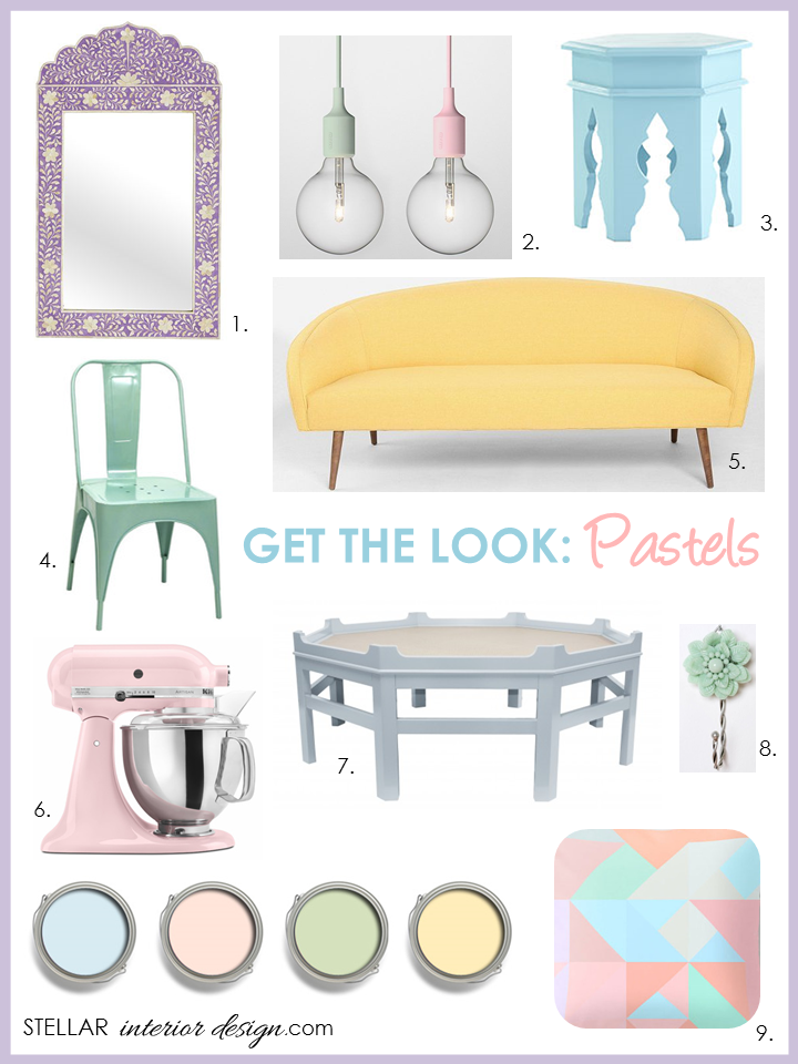
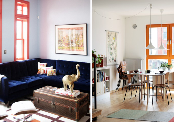
Every year I like to discover what the trends will be for interior design but specially the color trend palettes are always a treat to see. Here is a sneak peek of two color trends for Spring/Summer 2015: Mid-Century Modern and In Harmony.
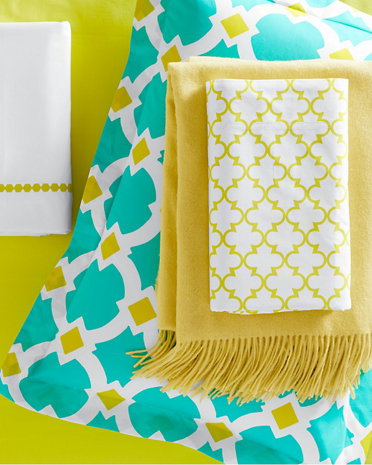
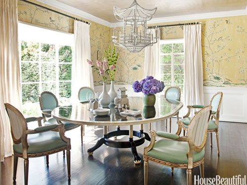
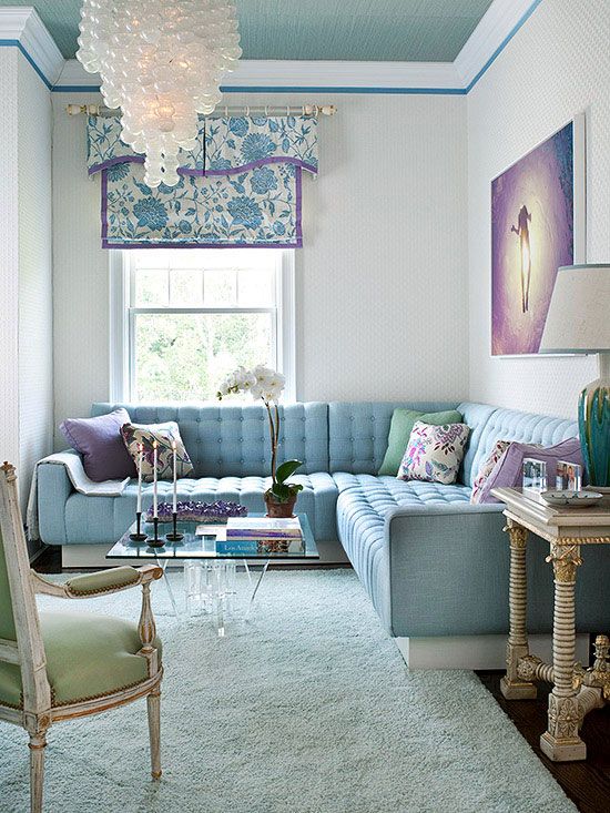
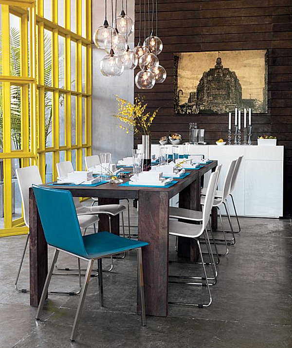
MID-CENTURY MODERN COLOR STORY SPRING/SUMMER 2015
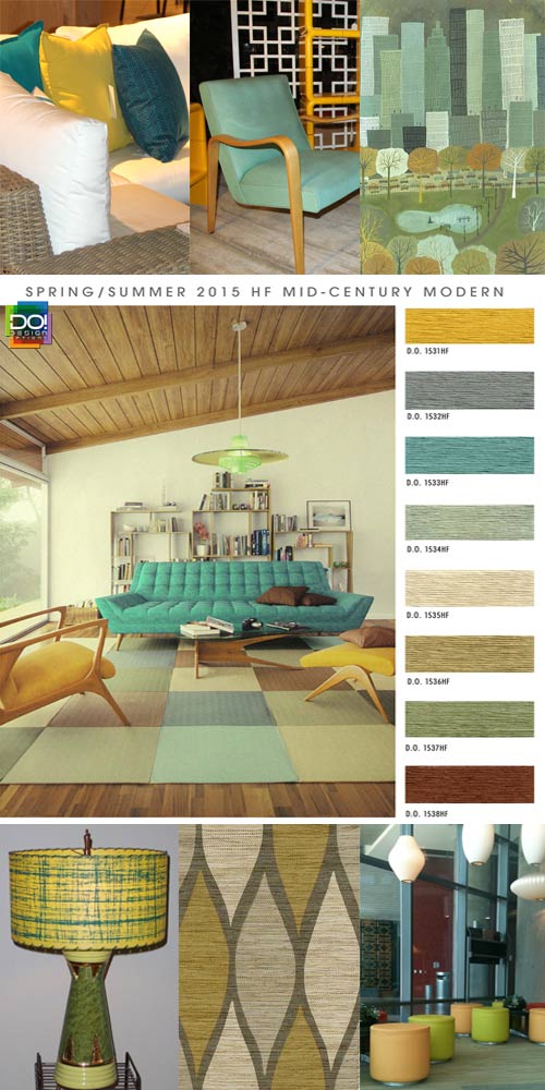
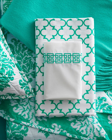
MID-CENTURY MODERN – Mustard yellow and burnt sienna shades of untouched territory and au courant create a lively atmosphere while adding sleek texture to wooden finishes. Light turquoise blue and sea foam green tones amplify elusive shapes.
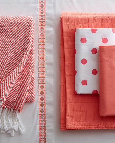
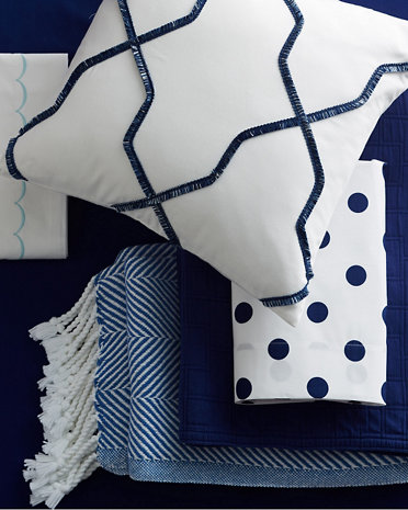
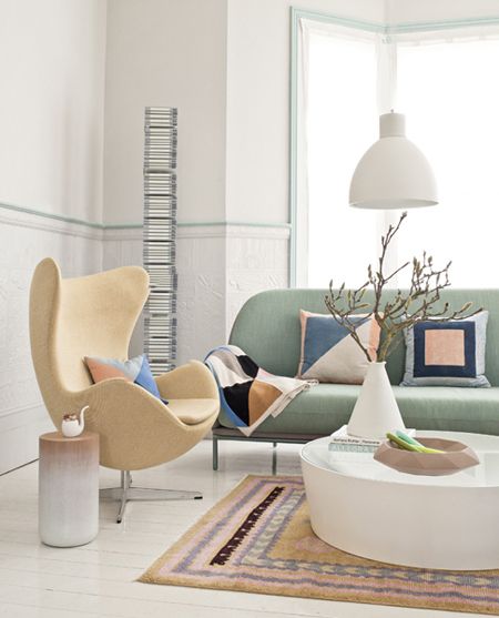
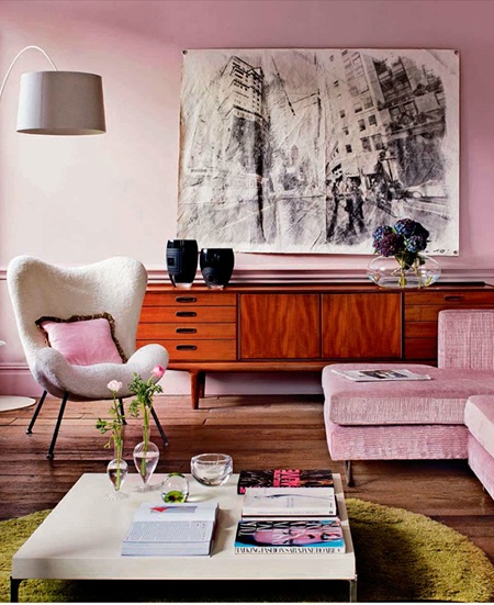
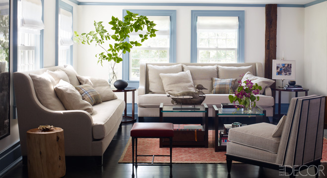
HARMONY COLOR STORY SPRING/SUMMER 2015
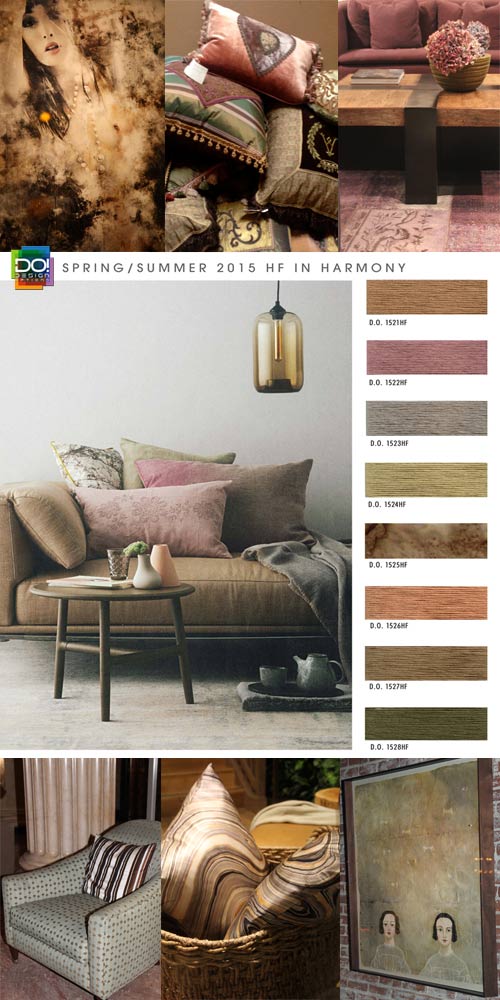
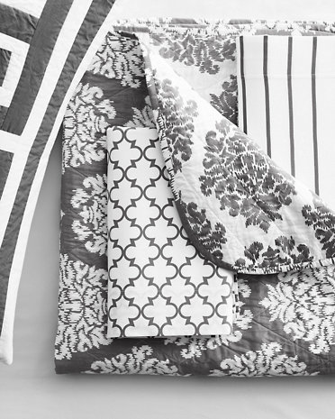
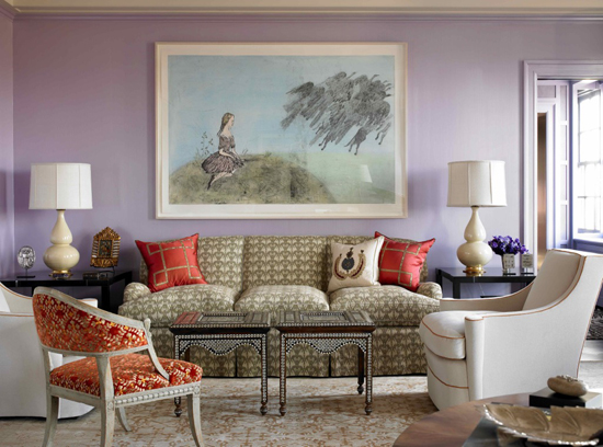
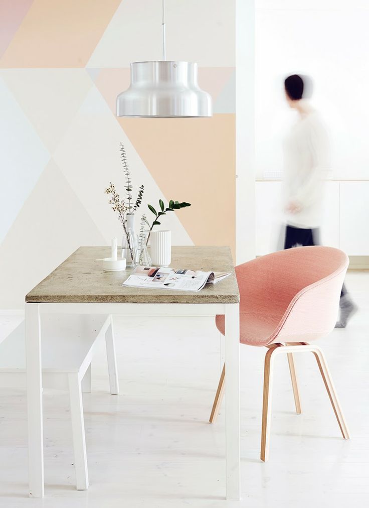
IN HARMONY – Deep mauve and soft apricot shades of consistent oscillation and balanced equilibrium draw attention to elongated bold lines. Chestnut and dark khaki tones of serene counterbalance and equanimity accentuate suave silhouettes.
Which color story is your favorite? Would you like color advice for your own home or space?
For more information on my interior design services or online e-design please visit my website.
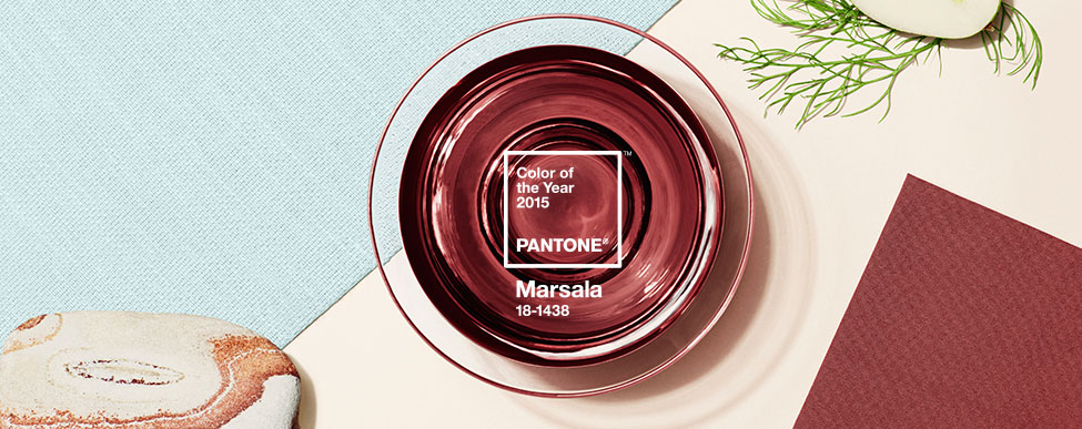
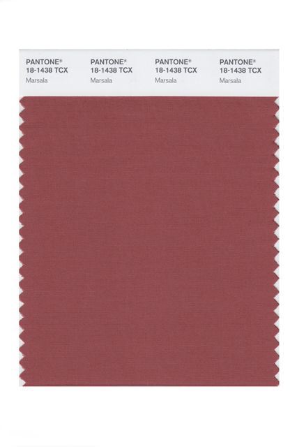
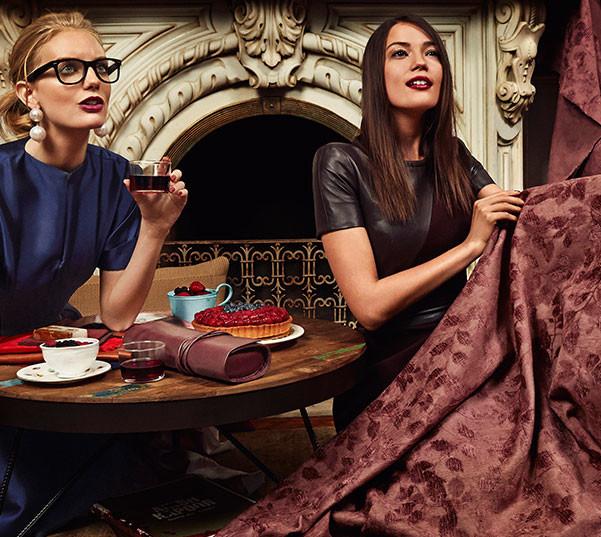
[images via]